
Logo vs Branding: What’s the Difference?
Your logo is one asset. Your brand is the wider system people recognise, remember, and trust. Here is how the difference plays out in practice.
· 8 min read
Quick takeaway
A logo helps people identify your business; branding shapes how the business is recognised, remembered, and trusted.
A logo and a brand are related, but they are not the same thing. That distinction matters because many businesses expect a logo alone to fix clarity, consistency, and trust problems that are actually broader brand issues.
A logo identifies your business. Branding shapes how the business is recognised, remembered, and experienced.
That misunderstanding is very common, especially for small businesses. Someone knows the business needs to look more professional, more consistent, or more established, so they ask for a new logo. The problem is that a logo can only carry so much weight on its own.
If the colours feel random, the website lacks direction, the tone of voice changes from one touchpoint to the next, or the business looks different every time it appears somewhere new, the issue is not really about the mark. It is about the brand system around it.
The simple definitions
A logo is a mark, usually a wordmark, symbol, or combination, that helps people identify the business quickly.
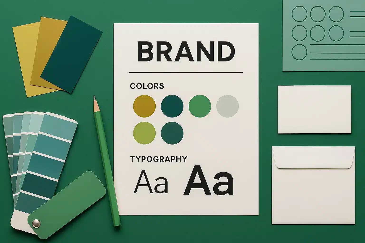
Branding is the wider system around that mark: colours, typography, imagery, tone of voice, layout decisions, and the rules that keep everything consistent.
A useful way to think about it is this: the logo is one recognisable part of the identity, while branding is the full set of decisions that shape how the business shows up. One is an asset. The other is the framework that makes the whole presentation feel coherent.
That is why two businesses can both have technically decent logos, but one still feels much stronger, clearer, and more credible. The difference is usually not the symbol itself. It is the quality and consistency of the brand around it.
Why people mix the two up
People often use the word brand when they really mean logo because the logo is the most obvious visible element. It is the part that gets sent in a file, placed on an invoice, added to a social profile, or dropped into the top-left corner of a website.
But customers do not experience your business as a logo alone. They experience the tone, the clarity, the colours, the photography, the spacing, the words you use, the level of consistency, and the overall feeling of whether the business seems considered and trustworthy.
That is why a logo can be perfectly acceptable while the brand still feels weak. The mark may not be the problem at all. The business may simply need stronger design direction, clearer rules, and more consistent application across touchpoints.
What a logo does well
A strong logo helps a business look recognisable and more professional. It should work in different sizes, formats, and contexts without losing clarity.
What it does not do is solve weak messaging, inconsistent presentation, or a confusing website experience on its own.
A good logo should be distinctive enough to identify the business, flexible enough to work in different environments, and simple enough to stay clear whether it appears on a website header, a document, a sign, or a social avatar.
That makes it an important piece of the puzzle, but still only one piece. If the surrounding design choices are vague or inconsistent, even a strong logo ends up doing less work than it should.
What branding actually includes
Branding ties the whole experience together. It gives you a clearer visual direction, stronger consistency, and a more cohesive impression across your website, documents, social channels, and other customer touchpoints.
That consistency builds trust, and trust makes it easier for people to choose you.
What branding actually includes in practice
- A colour palette that feels deliberate and works consistently
- Typography choices that support readability and personality
- Rules for logo use, spacing, scale, and placement
- A style for imagery, graphics, icons, or illustration
- A tone of voice that sounds like the same business everywhere
- Layout and design principles that make touchpoints feel connected
- Guidance on how the identity should be applied across web, print, and social channels
Why branding creates more commercial value
Branding does more than make things look nice. It reduces friction. When a business feels clear and consistent, people find it easier to understand what it does, remember it later, and trust that it is established enough to be worth contacting.
That matters even more for small businesses, because trust is often fragile. If the brand feels uncertain, improvised, or inconsistent, visitors may assume the business itself is the same.
A stronger brand system also makes future design work easier. Instead of reinventing the look and feel every time you need a page, document, social graphic, or campaign, you are working from a clearer foundation. That saves time and improves quality at the same time.
Why this matters on the web
Good branding supports readability, hierarchy, and the overall feel of the site. It helps pages feel connected, credible, and easier to navigate.
If the site feels disjointed or each page looks like it belongs to a different business, that is usually a branding problem before it is a web design problem.
This is one of the biggest reasons the logo versus branding distinction matters. A website is not just a place to display a logo. It is one of the main places where the brand gets experienced in full.
If the website has no strong brand direction, the result is usually a patchwork of borrowed ideas. The logo might sit at the top, but the colours, headings, buttons, imagery, and language do not feel connected. That weakens the impression of quality very quickly.
Strong branding gives the website a clearer visual logic. It helps you make better decisions about hierarchy, spacing, colour use, imagery, section styling, and calls to action. In other words, it makes the site feel like it belongs to one confident business rather than a collection of unrelated pages.
A practical example of the difference
Imagine two businesses with similar services and similar levels of experience. Business A has a tidy enough logo, but the website colours shift from page to page, the typography feels inconsistent, the copy has no clear tone, and the social graphics all look unrelated. Business B has a logo too, but it also has a clear palette, a recognisable style, a consistent voice, and a website that feels cohesive from top to bottom.
Even if the logos were equally good, Business B would usually feel more established and easier to trust. That is branding at work. The customer is responding to the full experience, not just the mark in isolation.
This is why a rebrand can sometimes transform the feel of a business without needing a dramatically complex logo. The lift often comes from consistency, clarity, and direction rather than from a clever symbol alone.
When a logo-only approach is enough and when it is not
There are situations where a logo-only job can be perfectly reasonable. If the business is very early stage, the touchpoints are minimal, and you simply need a recognisable mark to get started, that can be enough for now.
It stops being enough when the business is actively trying to look more credible, become more memorable, appeal to a better-fit audience, or bring more consistency across the website, social channels, documents, proposals, and sales materials.
At that point, asking only for a logo usually under-solves the problem. The business does not just need something to place on the top of a page. It needs a clearer system for how it presents itself.
Signs you probably need branding rather than just a logo
- Your website and social channels do not feel like the same business
- You have a logo, but the overall presentation still feels inconsistent
- Your colours, fonts, or imagery change depending on who makes the asset
- The business feels less established online than it does in real life
- You are redesigning the website and need clearer visual direction
- You want to improve trust and recognition, not just replace a mark
Where to start
If you only need a mark, start there. But if the business lacks consistency, confidence, or a clear feel across touchpoints, you probably need more than a logo.
A small but well-structured brand system often creates far more value than a standalone logo delivered in isolation.
The most useful starting point is usually not asking what the logo should look like. It is asking what the business needs to communicate more clearly. Should it feel more premium, more approachable, more established, more specialist, or more aligned with the type of client you want to attract?
Once that is clear, the identity work becomes more purposeful. The logo still matters, but it becomes one part of a wider system that supports the way the business needs to show up.
That is why the best branding projects tend to produce more than a mark. They create a clearer, more usable foundation for the website and every other customer-facing touchpoint that follows.